Clubr is an easy-to-use, streamlined, social media app allowing clubs to easily update and post information and allows students to access that information effortlessly.
No items found.
What's the problem?
User research + Market Analysis
User research
Our first step in finding out whether this was a problem we needed to design for, was to find out if it was even a problem at all. We surveyed students to find out the number of students involved in clubs on campus and other information regarding how they found the club. Our research was administered via a google survey link posted in online groups composed of UW students and in class. We received 54 responses and got the following data
52% of respondents weren't in a club
Of that 52%, roughly 82% of respondents wanted to join a club, but didn't feel they were able to find one / contact one
65% of students found clubs via one time events such as the club fair which is held for only two days the entire year
60% stated a revamped or easy to use website would help them get involved in clubs
Market Analysis
Our research made clear that students do want to be involved in clubs but just couldn't find the right information. To find what our solution should and shouldn't have, we looked at existing solutions and formats.
Club Directory Site
Has every club that's created on the site
Clubs rarely update that information, or put any information at all.
Updating information was convoluted and inefficient
Facebook Groups
Easy to add people to the club
Quick and full control of adding information or events
Not easy to find a club if a student is just browsing for a club
Greek Life Site
A consolidated site for all greek life related clubs / sororities or fraternities
Frequently kept up-to-date
Is constrained to only greek life related groups
With all the research gathered, we were able to create a problem statement to help scope our project, focus the team on what our problem is, and reference to ensure we're solving what we set out to solve.
Problem Statement
How might we help students at the University of Washington better find and connect with clubs on campus in order to help engage students and provide them with a fulfilling extracurricular college experience?
How do we solve it?
Sitemap + Wireframes + Testing + Mockups
Requirements
After assessing all the current options we created a list of must haves:
We must host all clubs and greek life
Allow clubs to easily update all information
Allow students to contact clubs directly
After brainstorming platforms for our solution, we landed on a mobile app. 95% of undergraduates own a smartphone and can access their phones on the go faster than a laptop. This makes sense for trying to find where the clubs meet on the go or messaging a club board member as you're trying to find them.
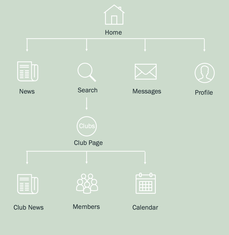
Sitemap
Before starting to prototype, we built a rough sitemap to guide our designs. The site map helps us visualize the structure of our app before we build it, which in turn makes it easier to build.
Our site map was low-fidelity so we can have a rough outline. We chose the main features that we knew were must-haves like a messaging system, searching for clubs, and accessing events via a calendar. This final flow and mapping of our design were slightly different, but this was a good reference to get started.
Low-Fidelity Prototyping
We then went into our prototyping phase. We started out creating user flows on a whiteboard with tasks in mind. Our initial tasks were based on our main features. We drew out screens to message a club, find all clubs, and find contact information on a club. After this we created our first iteration of lo-fi wireframes:
User Feedback and Testing
We used a mix of both subjective and objective data to get a full picture of how our solution was working for our users. From our feedback we gathered that:
Users would like their own events calendar for the clubs they are apart of.
Users stated no way of adding clubs to their newsfeed
Users had trouble finding how to post to a club
This feedback and testing were insightful for finding out whether our intended and constructed solution aligned with our user's wants and needs. We seemed to have hit the mark on what was deemed essential functions, but our testing showed that we needed to improve some of the holes in our interactions and logic as well as add additional features that our users pointed out as being useful to them.
How We Solved It
Design System + High Fidelity Mockups
Design System
After going through one more round of reiteration and gaining user feedback, we fixed the gaps in our logic and interactions. We then moved into blocking out our screens in Figma. We did not incorporate any color or pictures yet so we could get a feel for if our paper designs would even translate to phone screens. After we translated it to a phone screen, we moved into incorporating things such as font, colors, and iconography. We also created a design system since we were working on different screens. In addition to our component library, we used the following colors and type:
We chose #99B899 which is a deeper, yet creamy green as our branding color. It represents life and growth, just as we aim to increase the growth of community involvement in clubs as a result of solving our problem
#F7F7F7 is used as our background color that posts are on top. This keeps the focus on the information, not the color.
All interactive / important information is placed on top of #FFFFFF so it pops out.
Open Sans was chosen because it was designed specifically to be legible across print, web and mobile interfaces.
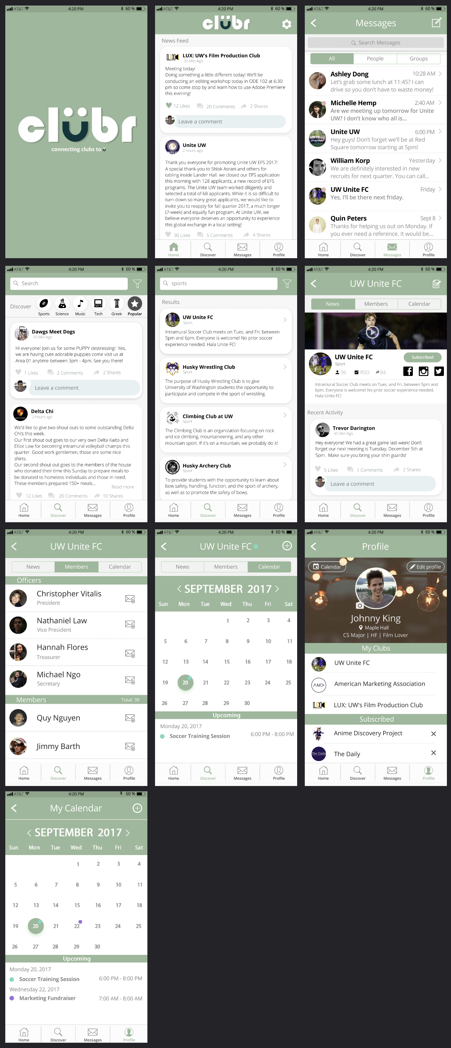
High Fidelity Mockups
How Did We Do?
Reflection
This was my first exploration into user experience design and catalyzed my interest in UX. I learned how to go through the design process more formally and dip my toes in more aspects like user testing and research. I walked away from this with a passion and hunger for learning more about UX design and how to solve real problems people face. We also won first place in the course competition!


