Winston Chen, Tammy Hu, Victor Kuan, Tiphanie Leung, Anna Shi, Jun Song, Kayvon Tari
TL;DR
KiwiLink is a mobile app that allows students to connect with other students with similar classes, hobbies, and interests, create a higher level of education, and reclaim a part of the college experience that the pandemic has taken from them. Through KiwiLink, you can study for classes, make friends, and meet other like-minded individuals.
No items found.
What's the problem?
User research + Market Analysis
User Research
To know whether or not this is a problem that people are facing, my team and I conducted 30 interviews with students and sent out a survey that received 200+ responses. This research allowed us to gain insight into how students are finding others to connect with and what their biggest pain points were. It also was important in validating whether there was a problem that needed to be solved at all. Through our research, we found three key insights:
DM'ing peers on Zoom is uncomfortable and Professors can see those messages.
Messaging during class distracts from trying to learn
There isn't a place to keep in contact after class even if they do message another student
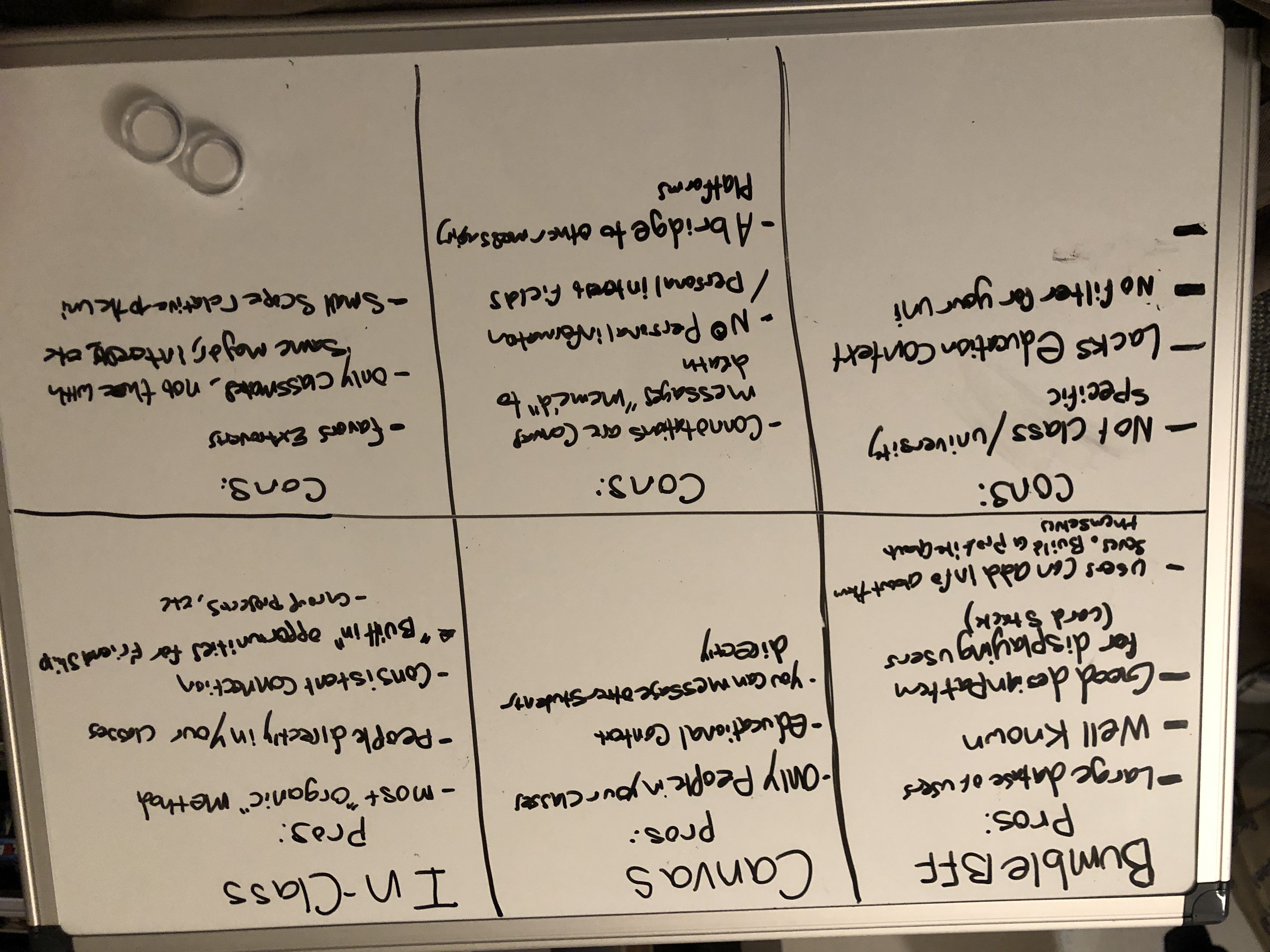
Market Analysis
To see what options students currently have to connect with classmates, we conducted a market analysis and a pros and cons list to find what aspects of each offer we want to include or improve upon in our solution.
After conducting the market analysis we were able to piece together key components that we wanted to bring to our solution.
Create a University-specific context to create a niche and specific target audience
Allow users to create a profile that lets them expand on their hobbies and interest outside of the classroom
Match students with the same classes first, then by interests.
With all the research gathered, we were able to create a problem statement to help scope our project, focus the team on what our problem is, and reference to ensure we're solving what we set out to solve.
Problem Statement
How might we help students at the University of Washington connect with other students with similar classes and interests within a dedicated space so that they can achieve higher academic sociability resulting in higher grades and a reclamation of their college experience during the pandemic?
How do we solve it?
Persona + User flow + Wireframes + Mockups
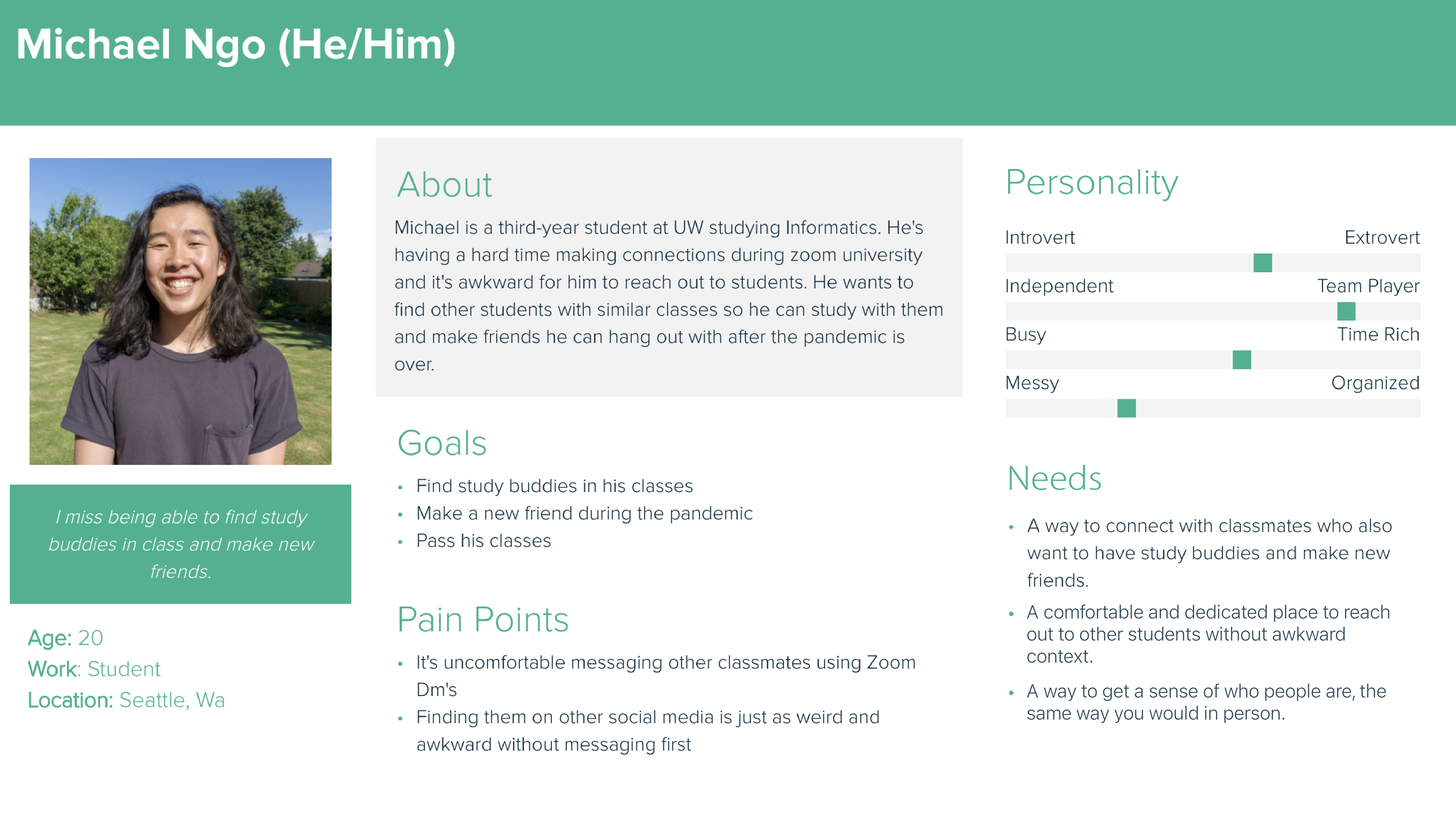
User Persona
After our user interviews and survey, we felt we had the right resources to create a person for us to help reference as we design. Our person was based on the average user we expected to benefit the most from KiwiLink. This was a valuable resource for us to have as we designed so we could validate our design decisions and make sure we were meeting our user's goals and needs.
Designing In a Virtual World
The wireframing phase was a really interesting experience having it all be conducted virtually! It was difficult trying to communicate ideas at the wireframing and low-fidelity design stages as we couldn't just talk and point to things, but send photos and wording which could be misunderstood. But we made it work and had long zoom sessions going back and forth sharing wireframes.
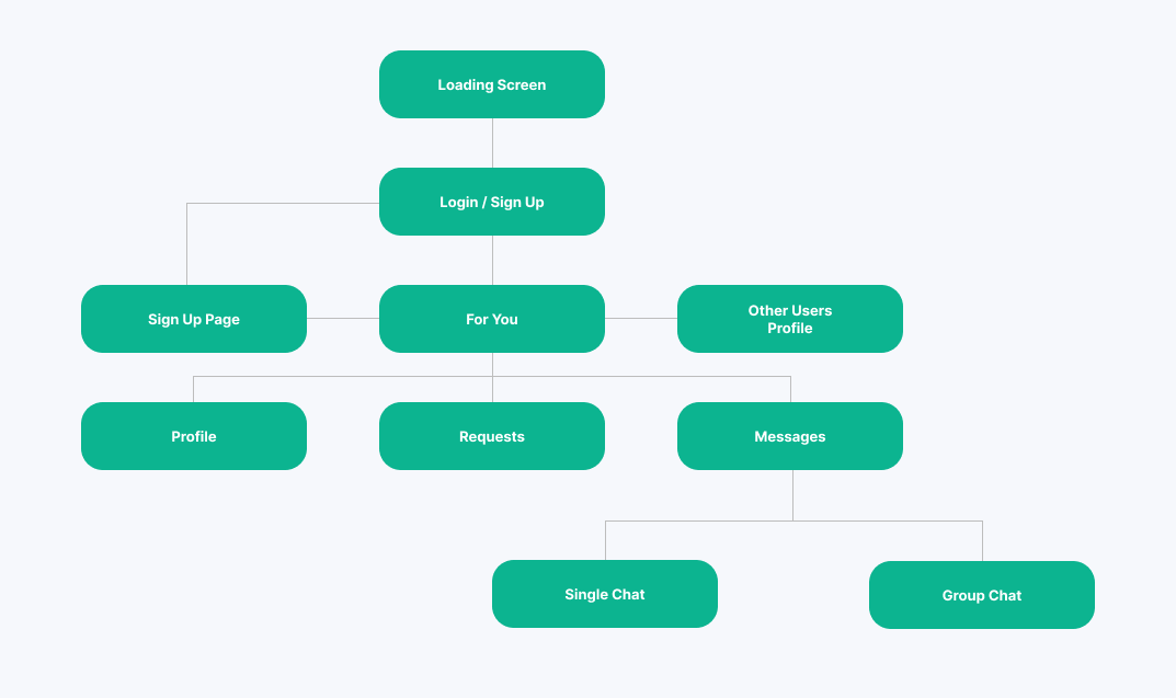
User Flow
This app had a lot of moving parts going on, but our main goal was to connect students and allow them to make new study buddies. With that in mind, we set to make seeing other students you can connect with the first screen you see. We added a site map to make it easier to understand how our app would function on a base level without having designed all the screens yet.
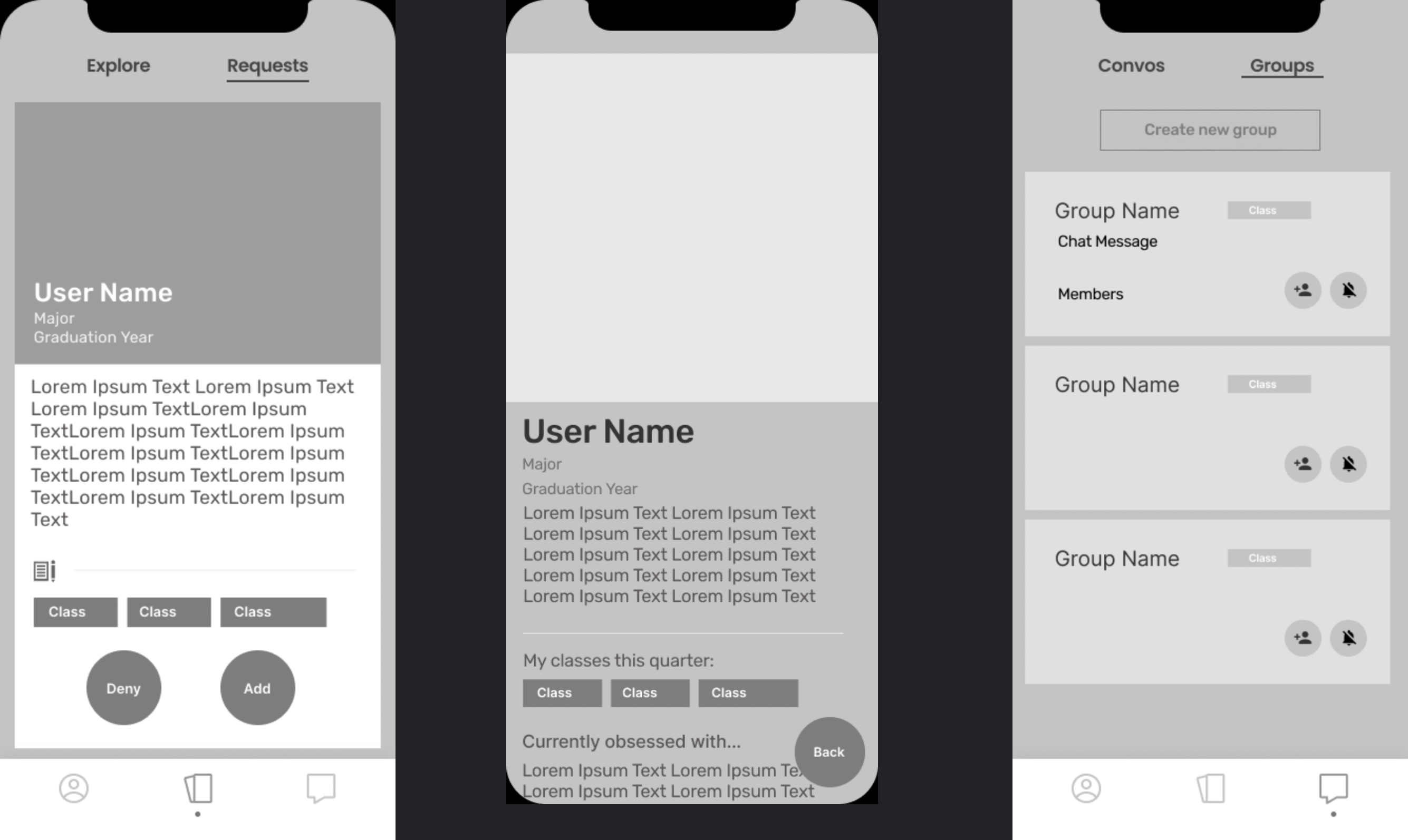
Mid-Fidelity Mockups
After getting a better understanding of how the flow and structure of the app will be, we made some mid-fidelity mockups to get more feedback at a level that showed more of the design and layout aspects.
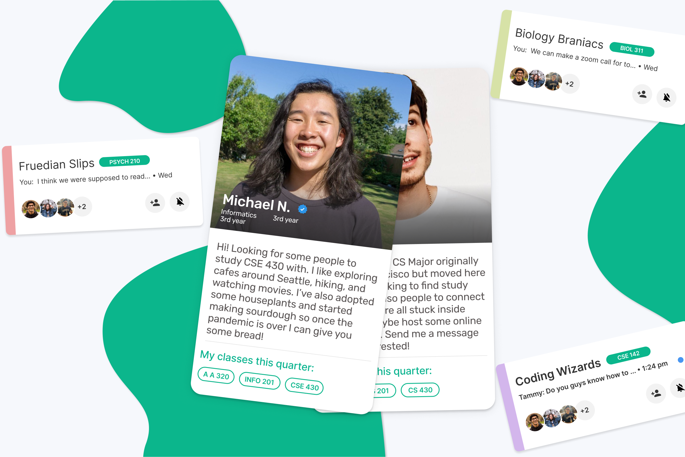
How We Solved It
High Fidelity Mockups
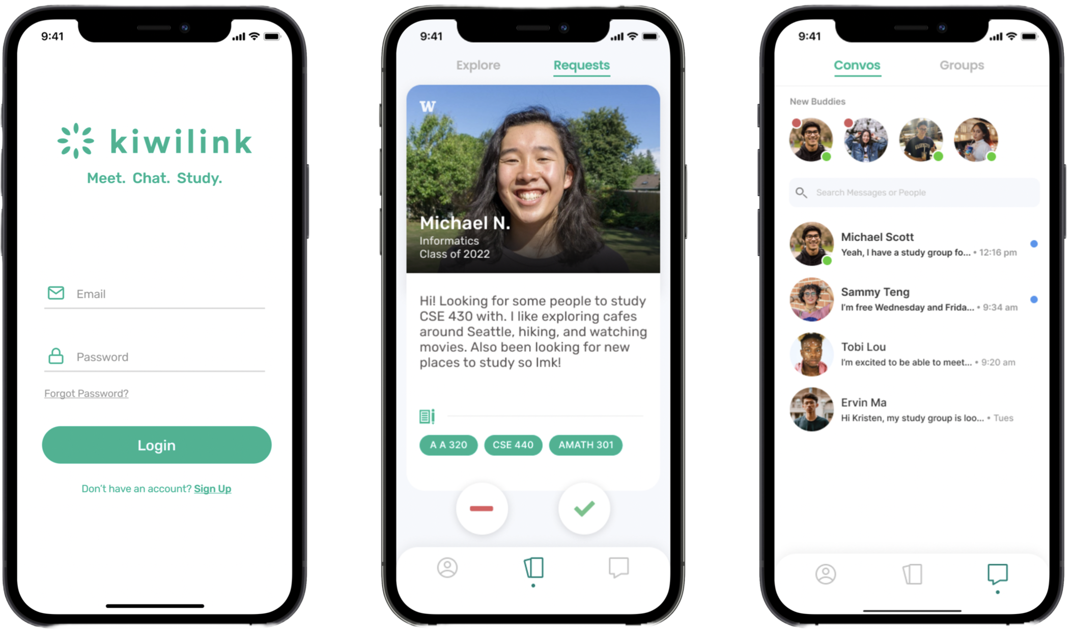
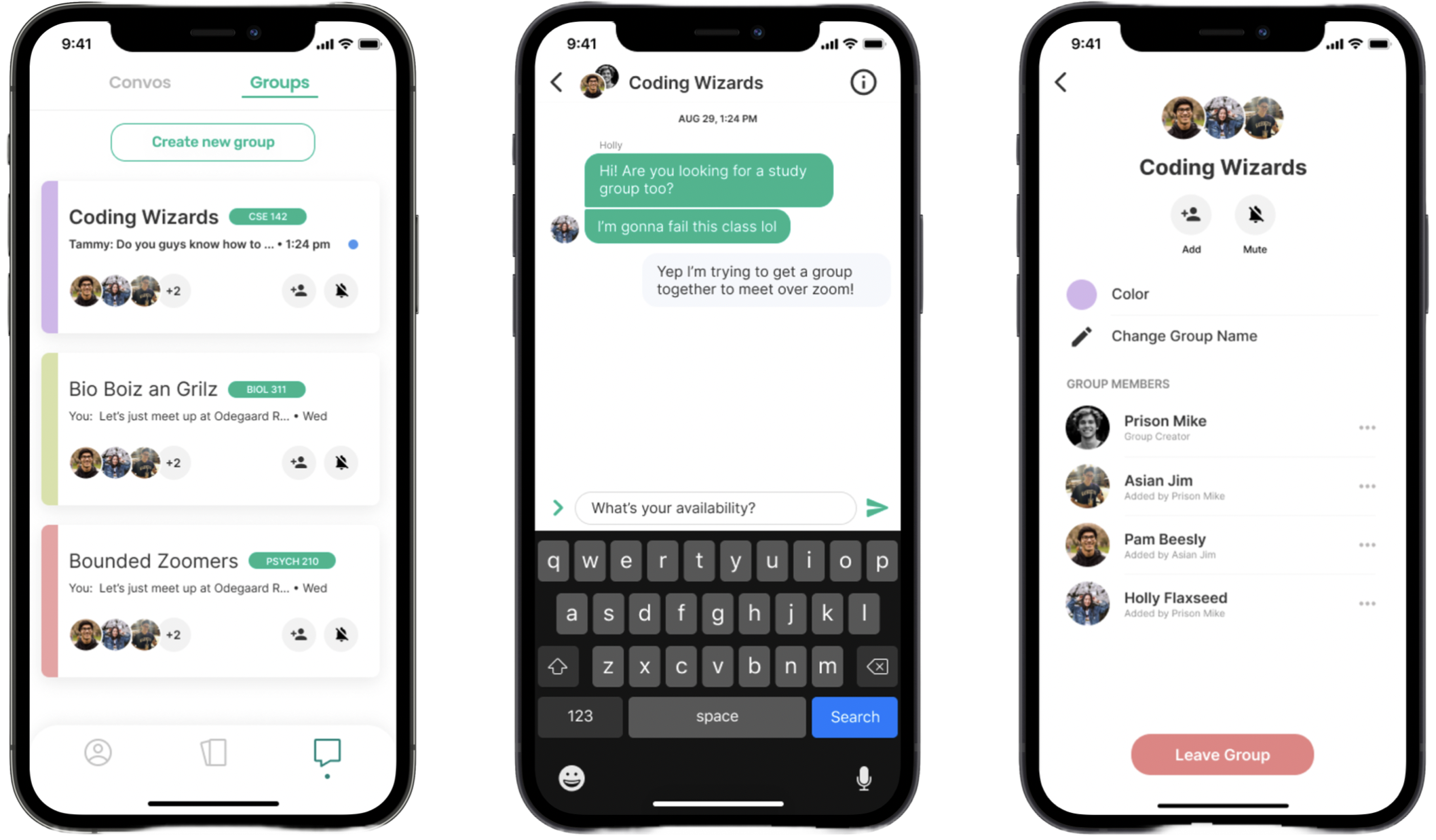
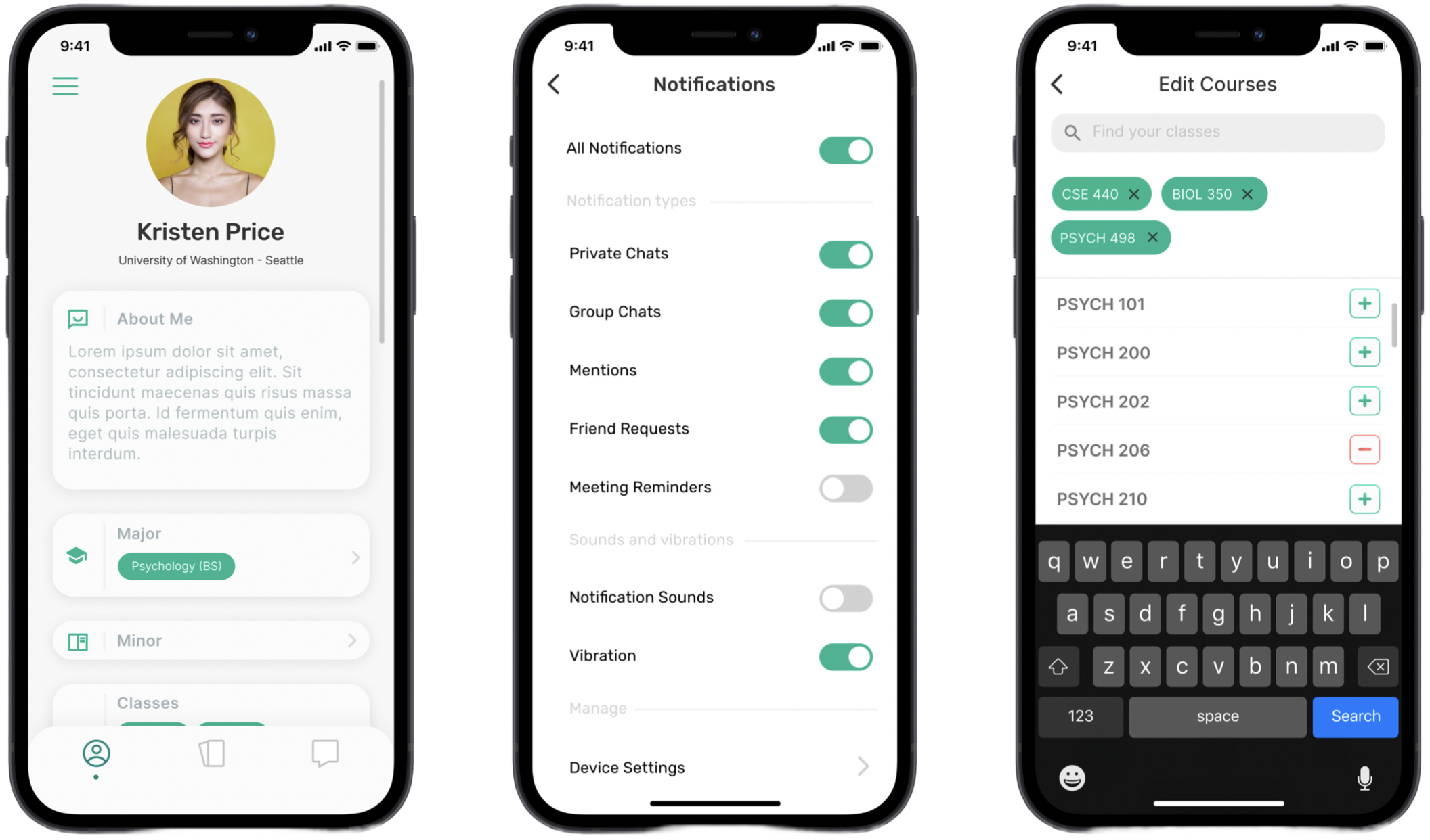
High-Fidelity Mockups
The final design of the project was based in countless rounds of user testing and feedback throughout the process. Below are some screenshots of the prototypes we handed off to our developers to implement into our final app we launched! We had continual communication and design tweaks as our developers ran into technical limitations and constraints but always found ways to move forward and have creative solutions.
How Did We Do?
Reflection
This project showed me that I am capable of making the changes I want to see in the world. It sparked a passion in me that revolves around designing for social good and helping people facing real issues. Since our launch, we have amassed 1,100 downloads, and over 11,000 connections between users in the app!
